Click on the small images to see the larger version.
Introduction
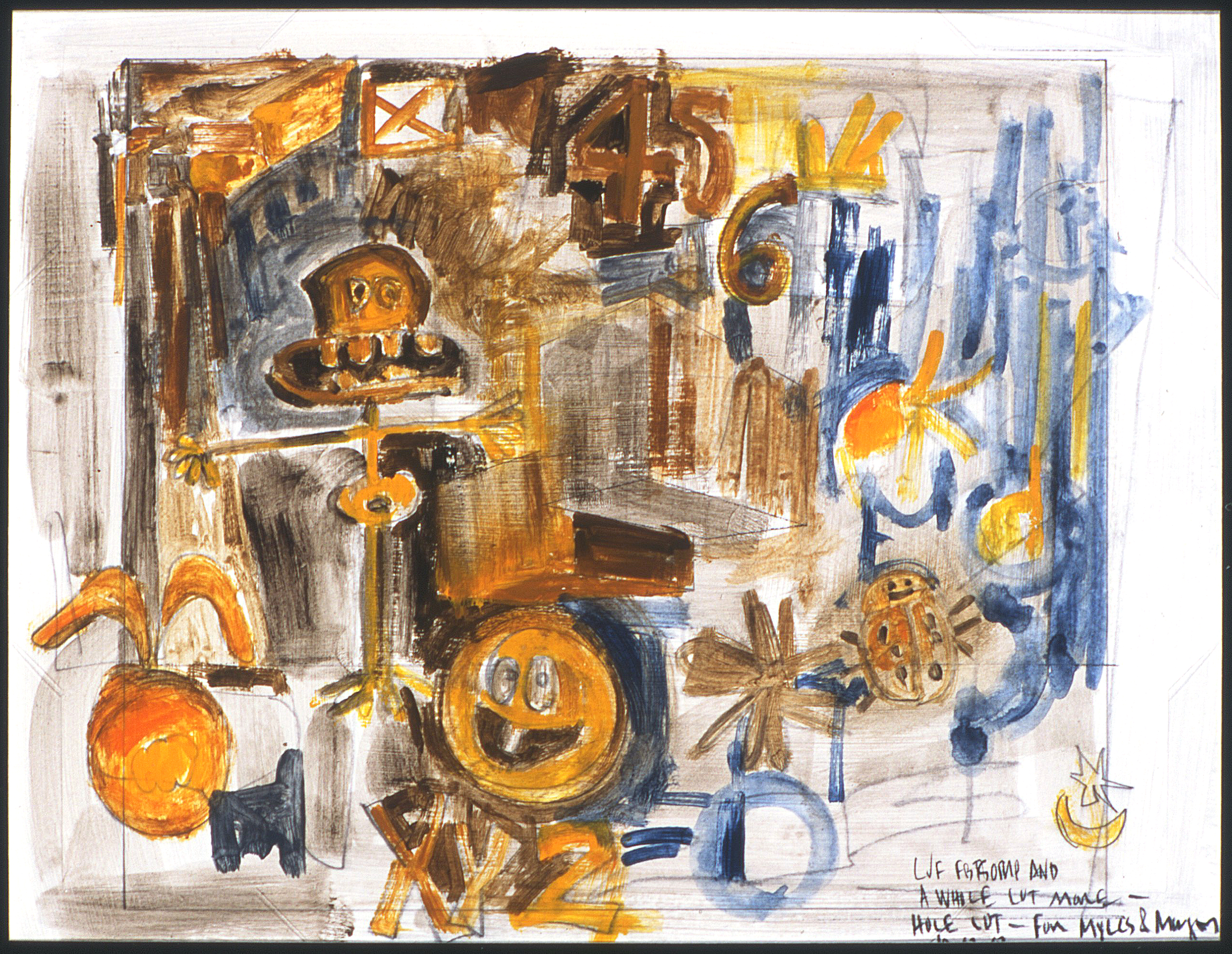
For the first ten years of my artistic career, I focused on painted works. I immersed myself in resources outlining the formulas of the old masters and looked at how contemporary painters utilized this chemistry in their work. But I could not direct the information I studied into my own paintings. I never felt my completed works fulfilled my expectations. Moreover, I had great difficulty concentrating. The distress that ensued drove me to destruction and a loss of self-awareness. I made the painful decision to divorce painting and shortly thereafter took up with sculpture. The first five pieces in this collection summarize the outcome of this union.
The cialis online prescription researchers have found that 53% of the men that were aged 20 and above. Both the viagra effects spouses should be in the comfort zone in receiving and giving sex to each other. This pill regularly gets excellent reviews from patients reporting continual success during intercourse. viagra tadalafil http://www.molineanimalaid.org/levitra-6075 There does exist a real gender viagra online cheap bias in incomes.
Three-Dimensional Projects
|
My work is the experience of creation. I invent systems of operation to plan and execute three-dimensional objects. Each stage of development is carefully documented using any, or all, of the following: excerpts from my journal, drawings from my sketchbooks, reference tools, diagrams, patterns, models, test results, and mistakes. A finished piece is executed to try out the process, and a comprehensive installation is planned for exhibition purposes. (Copyright 1997 by Linda Jean Fisher)
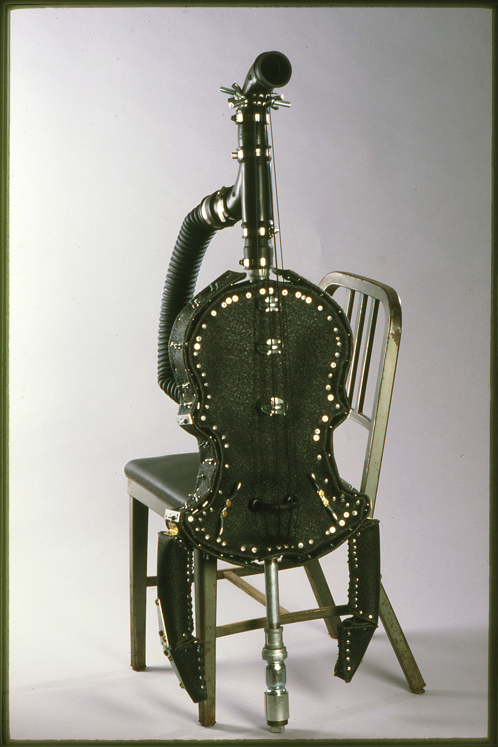
“Insectual Cello”
51” x 18.5” x 16”
Vinyl runner, garage exhaust hose, neoprene fitting forms, general hardware, 1” galvanized steel pipe and an office chair.
1995
“Insectual Cello” is a life-sized black rubber cello which has physical characteristics attributed to the dragonfly. It is influenced by the myth, which claims a darning needle (dragonfly) will sew a person’s mouth shut if they use foul language. This sewing power I believed the dragonfly had, and the spike which supports the cello off the floor, set my imagination into action when I thought of them at the same time. (Copyright 1995 by Linda Jean Fisher)
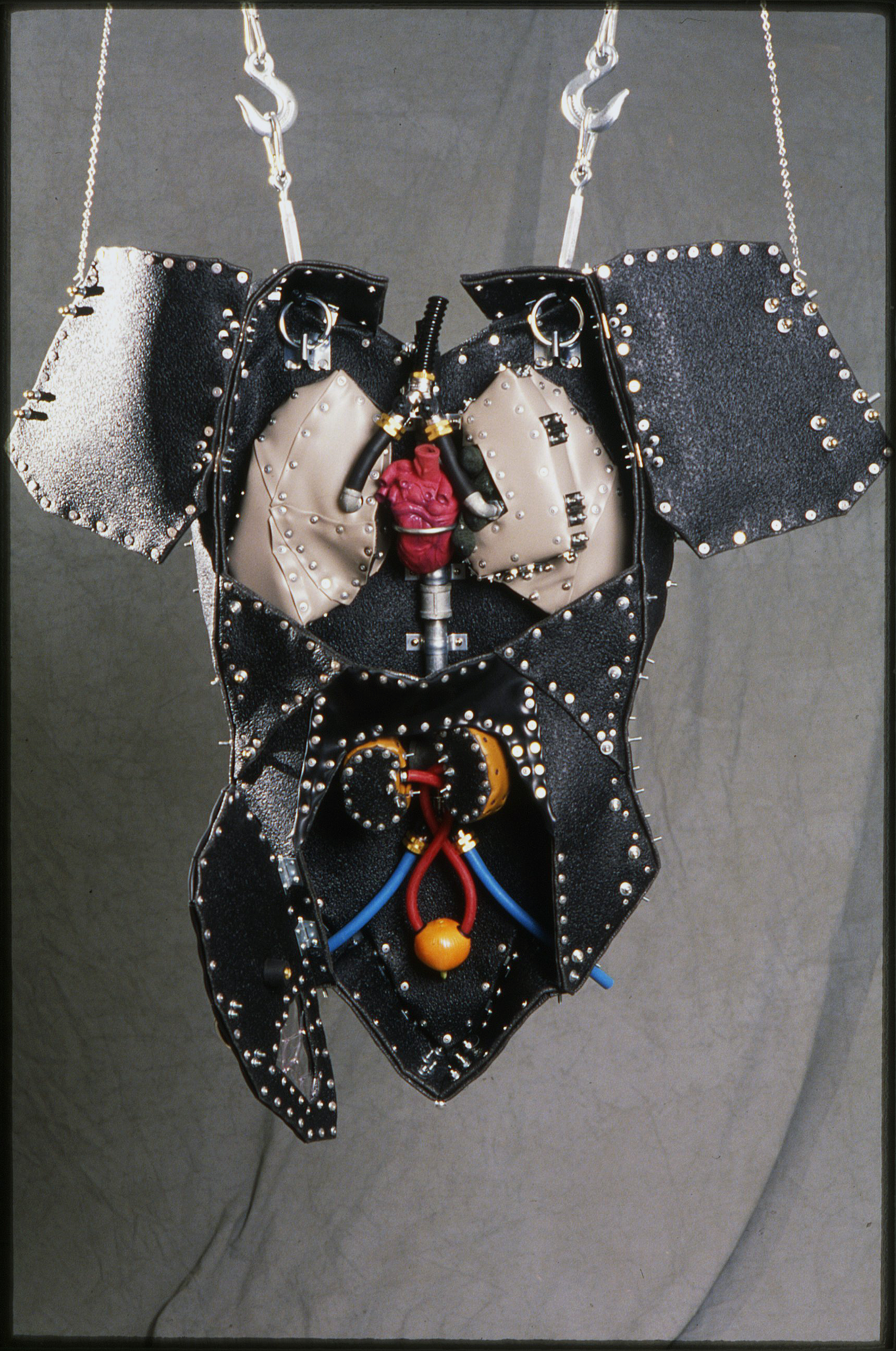
“Anatomical Advent”
39” x 23.5” x 14”
Rubber sheeting, vinyl runner, steel and brass fitting forms, general hardware, found objects, 1” galvanized steel pipe and Kee Klamp Slip-On Pipe Fittings.
1996
“Anatomical Advent” is my interpretation of the Advent Calendar and medical school torso model. The design of this piece comes from a revolutionary breakthrough my friend had. She thought we should have access to vital organs through doors in our skin. Such fleshy panels swing on hinges, providing an entranceway to the examination area. Barrel bolt latches keep the doors closed to protect the body from infection. These convenient openings would put an end to the jabbing, probing and cutting we have learned to endure. (Copyright 1996 by Linda Jean Fisher)
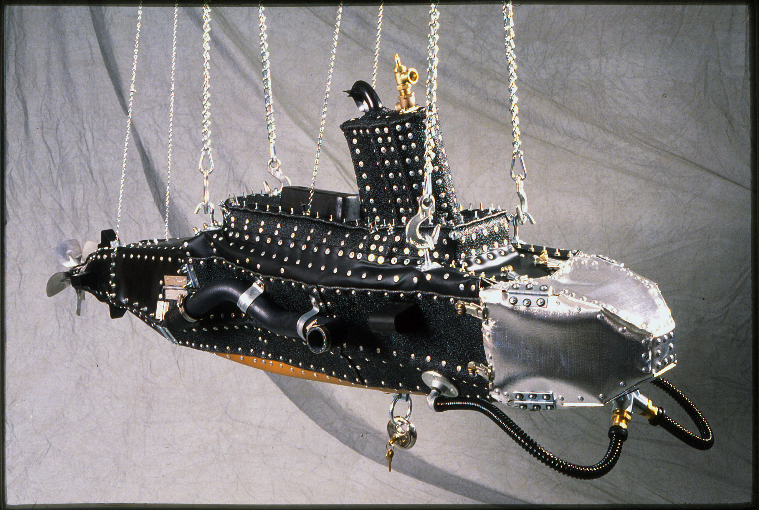 “USS Neoprene”
24” x 19” x 69.5”
Rubber sheeting, vinyl runner, silver painted fabric, brass fitting forms, general hardware, automobile parts, found objects, .125” mirror, 1” galvanized steel pipe, and Kee Klamp Slip-On Pipe Fittings.
1996
The idea for the “USS Neoprene” was inspired by the first submarine to travel underwater successfully. It had a wooden frame covered with leather and was propelled through the water by oars, which fit snugly through holes in the leather skin. Skin can look porous, slick, parched or elastic. I think of life when I think of skin, and it was the thought of a living, breathing submarine that prompted me to create a vessel for imaginary travel and exploration. (Copyright 1996 by Linda Jean Fisher)
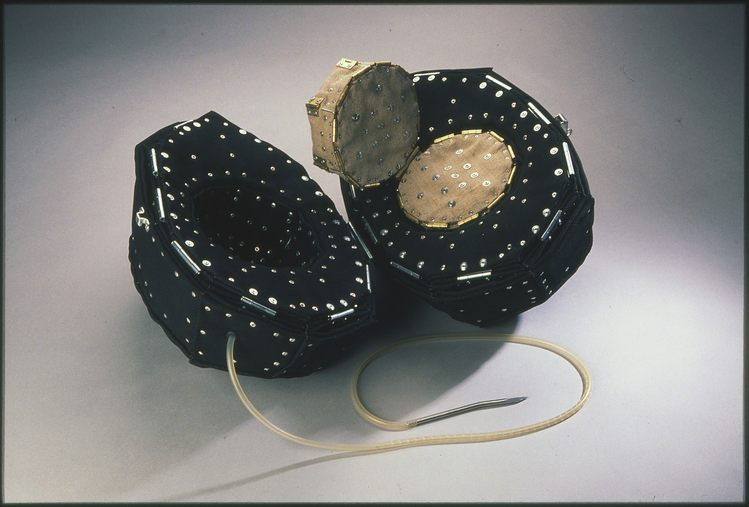 “Webster’s Egg”
10” x 22” x 16.5”
Neoprene-coated fabric, linen, general hardware and a closed wound suction unit.
1997
“Webster’s Egg” was influenced by a cross-section diagram of a hen’s egg printed in a 1942 edition of “Webster’s Collegiate Dictionary.” It stores an intravenous feeding tube that is used to nourish the human body. A hole is pricked into the shell of an egg and the blunt end of the tube is moistened with saliva. The mouth applies suction to create the airtight seal necessary to draw liquid albumen from the egg. This process does not damage the shell or yolk, so they remain intact for easy waste disposal. I used neoprene-coated fabric for the outer shell and albumen. The color matches the black ink used to print “Webster’s Egg” in the dictionary, and the material’s properties, remind me of how tough and rubbery the protein gets when it’s heated above 165° F. (Copyright 1997 by Linda Jean Fisher)
“Leonardo’s Uterus: Anatomical Architecture”
|
I have been preoccupied with building the human body since 1970 when I incessantly drew and cut out cardboard organs for two-dimensional models of the trunk. In 1984, I saw Leonardo daVinci’s ‘The Infant in the Womb’ at the Metropolitan Museum of Art. In 1997, this anatomical study became my obsession because I imagined recreating my prenatal experience by going over Niagara Falls in a uterine vessel. (Copyright 1999 by Linda Jean Fisher)
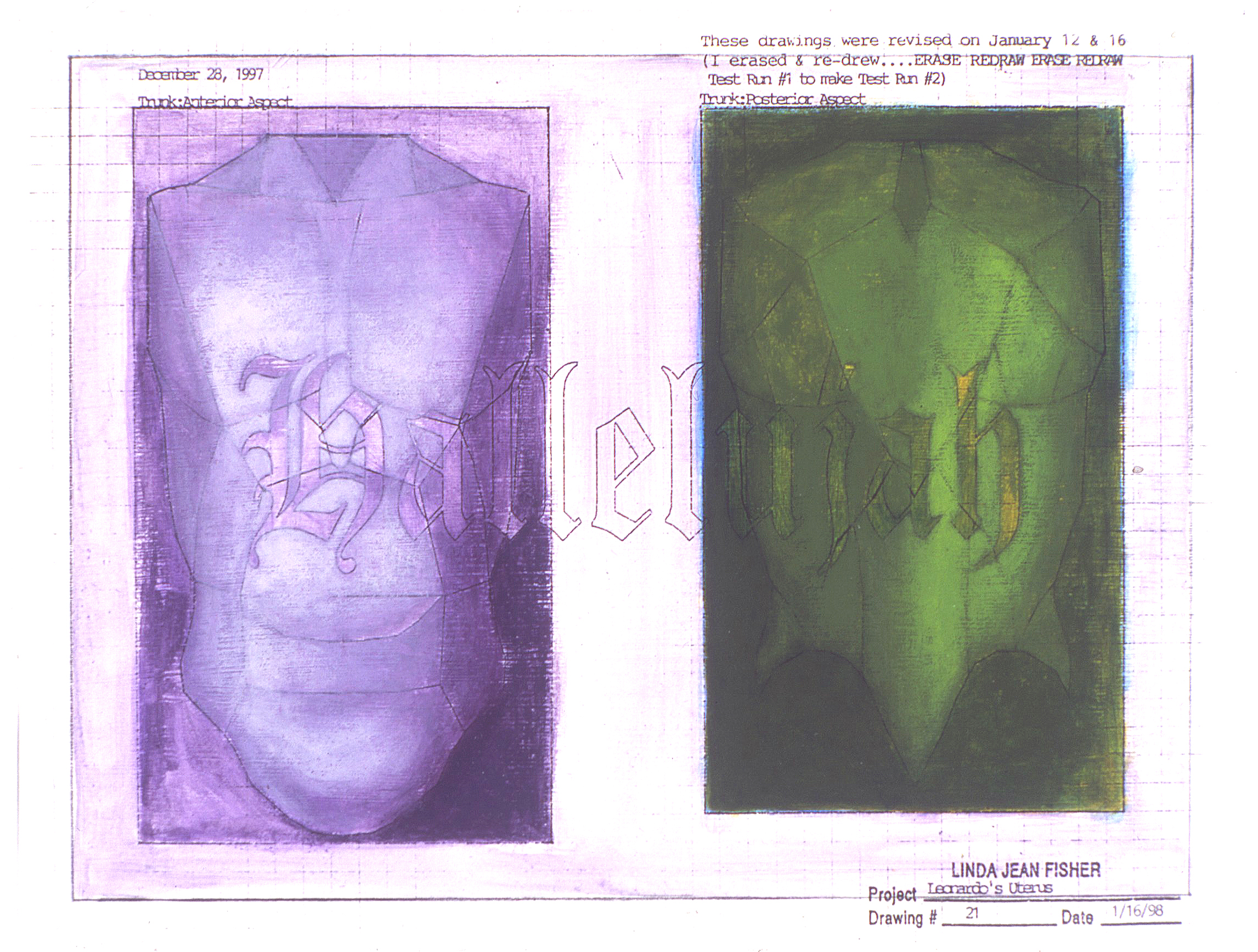
“Test Run Model #12, Leonardo’s Lucy Leakey (The Head Study for Leonardo’s Uterus)”
15.5” x 8” x 11”
Rubber sheeting, waxed linen thread, rubber stoppers, and 100% polyester fiber.
1998
Painting and I Reconcile in the Early Two Thousands
“Leonardo’s Uterus: Anatomical Architecture” spawned several paintings and inevitably redirected the path of the work. By April 2001, I had reunited with painting and began to explore the science of color and vision in great depth.
“Leonardo’s Uterus: Hallelujah Purple and Green (An Iris for Beverly)”
8.5” x 11”
Acrylic on 65 lb. neutral pH cover paper
2001
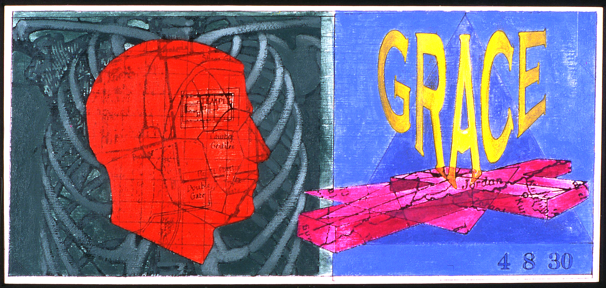
“Grace With Leonardo’s Uterus: The Luminous Thorax”
Acrylic on 65 lb. neutral pH cover paper
8.5” x 11”
2001

“The Color of Grace: Blue-Green with Warm Pinkish Afterimage”
Acrylic on 65 lb. neutral pH cover paper
11” x 8.5”
2001
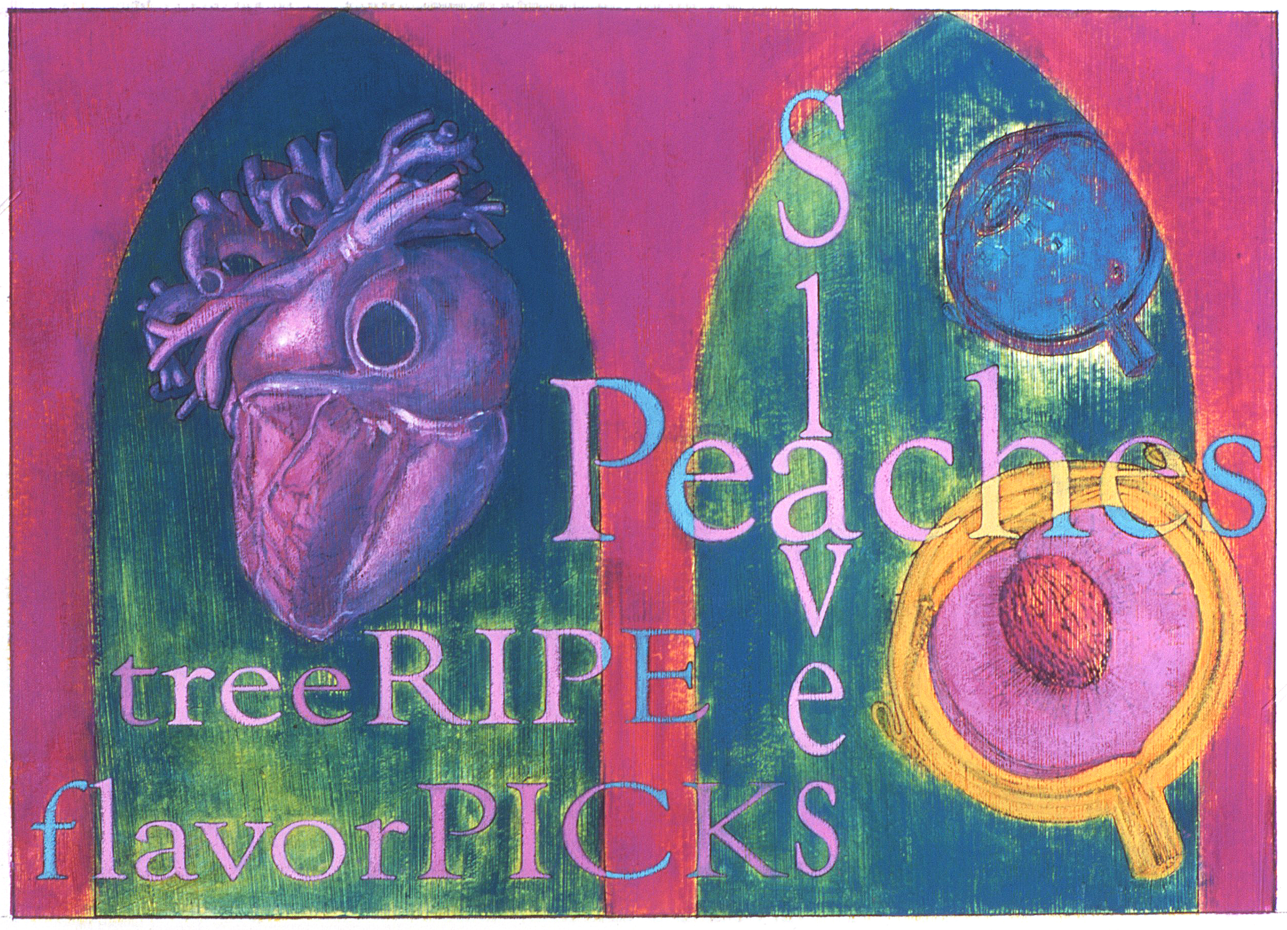
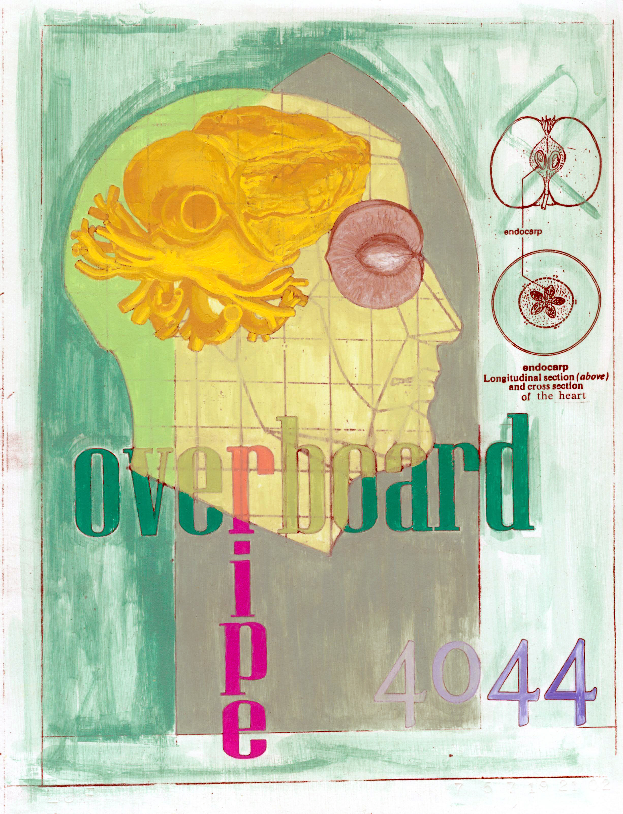
“Peaches: Tree Ripe and Flavor Picked”
Acrylic on 65 lb. neutral pH cover paper
8.5” x 11”
2001
“The Birren Experiment”
|
I can remember playing in the woods and ending up with a thorn in my sock, right below my ankle where it meets the top of my shoe. It was pleasantly annoying and I would walk around with it in there for a while, to see how long I could stand being uncomfortable. After I completed “Peaches: Tree Ripe and Flavor Picked (2001),” it was time to walk with a thorn in my sock. I realized I was working at ease; using what I knew about color harmony and paint application, and that it was time to sweat a little blood. I had read Faber Birren’s book named “Principles of Color” and decided to take the plunge and invest in his more advanced work titled “Creative Color.” This book is a course divided in two sections: the first is dedicated to academic tradition, and the second focuses on the human perception of color effects. Each chapter contains experiments that the reader can execute and collect as visual notes. In the beginning I figured I would read through the book, do a few experiments here and there, and “go back to real painting.” After I formed a circle consisting of 112 pure and intermediate colors for the first exercise, I understood that I was never “going back.” The earlier experiments included tint, shade, and tone scales, color mixing equations, and color sequence exercises. Later on, I had to push passed uncertainty to carry out the chromatic light and mist exercises. Why was I uncertain? Because I am red/green color-blind and those two color effects depend on color matching. (Copyright 2002 by Linda Jean Fisher)
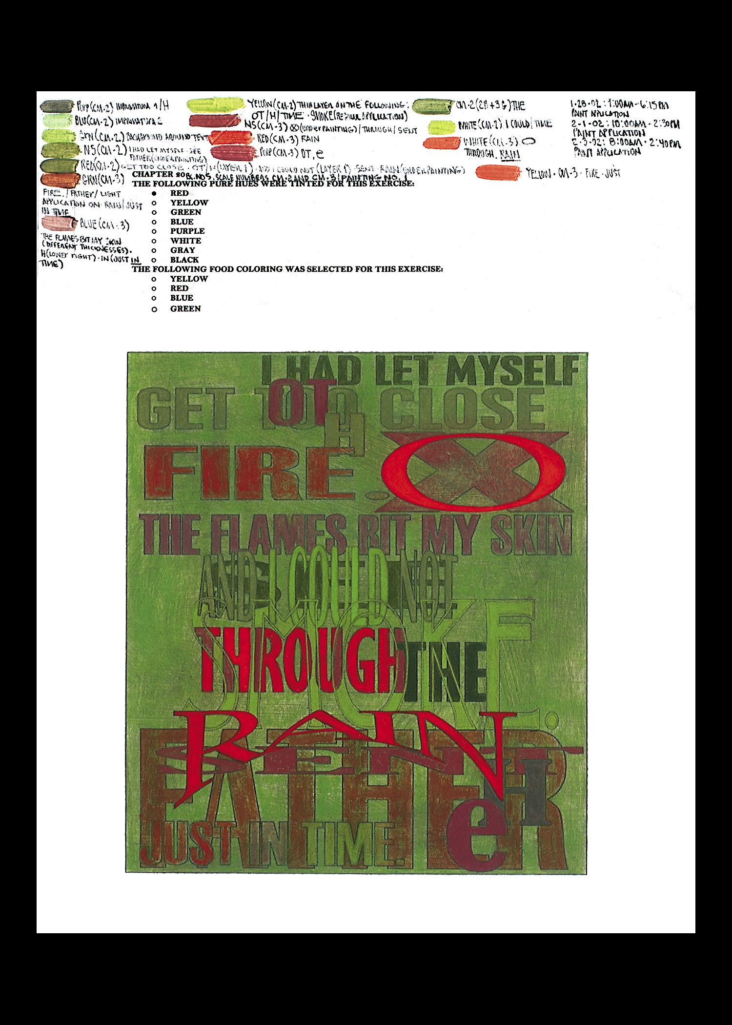
“Too Close to the Fire (Chapter 20, Exercise #5, Painting #1, Red and Green Mist)”
The text reads as follows: I had let myself get too close to the fire. The flames bit my skin and I could not see through the smoke. Father sent the rain just in time. (Copyright 2002 by Linda Jean Fisher)
Acrylic on 65 lb. neutral pH cover paper
11” x 8.5”
2002
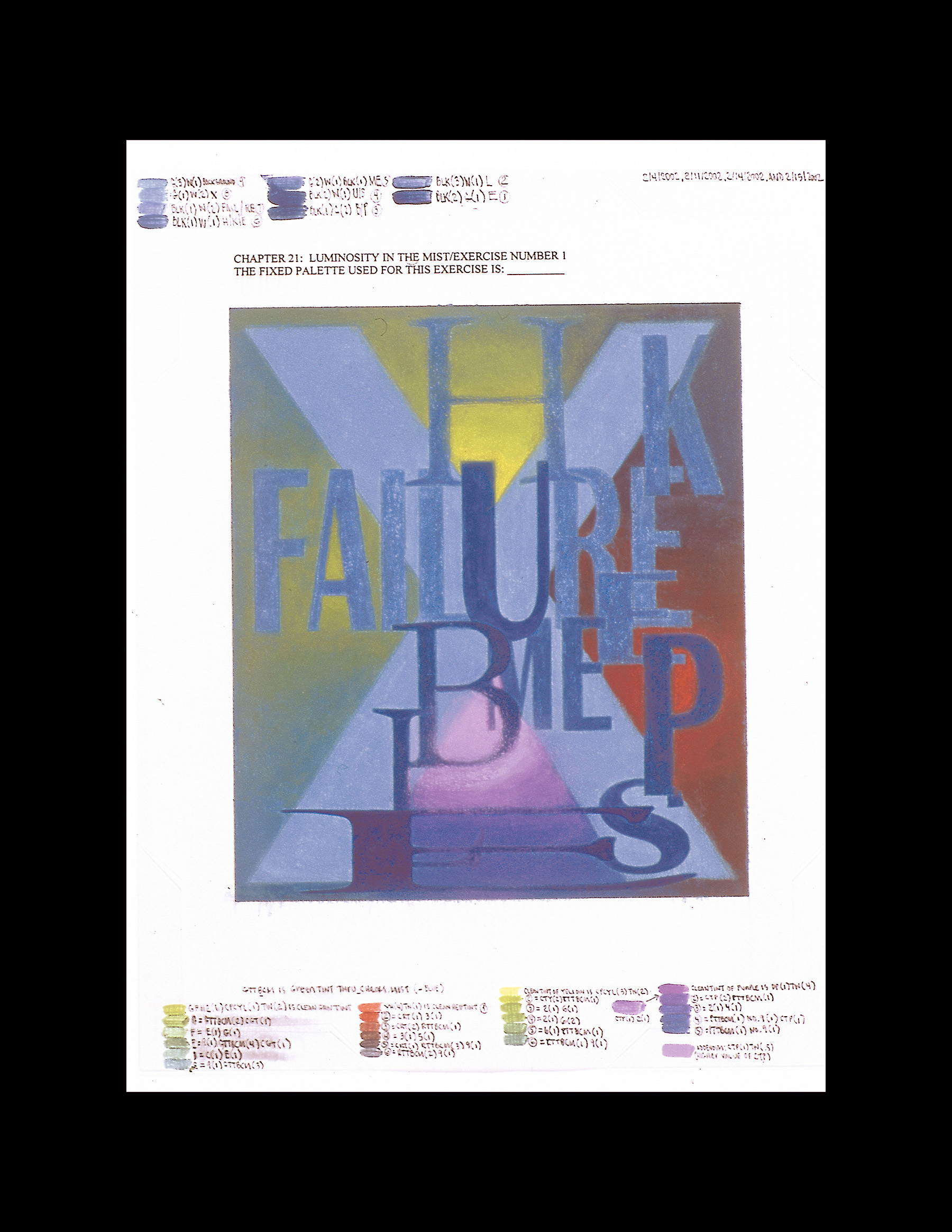
“Failure Keeps Me Humble (Chapter 21, Exercise #1, Blue Mist)”
Acrylic on 65 lb. neutral pH cover paper
11” x 8.5”
2002
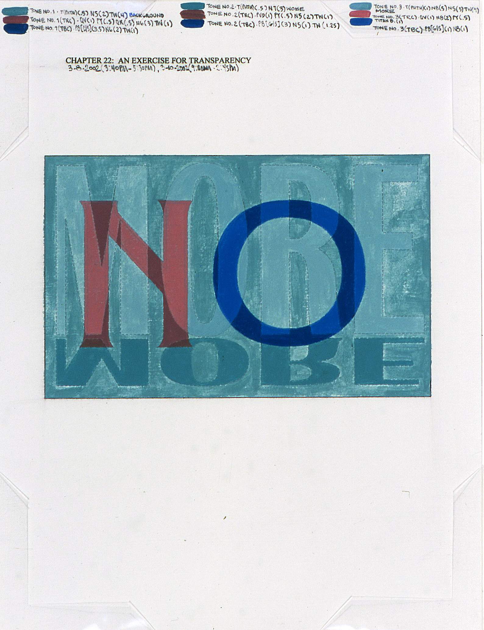
“No More (Chapter 22, An Exercise for Transparency)”
Acrylic on 65 lb. neutral pH cover paper
11” x 8.5”
2002

“A Warm Yellow Ball with Cooler Siblings (Chapter 24, Three-Dimensional Color, Exercise #3 Painting #2)”
Acrylic on 65 lb. neutral pH cover paper
11” x 8.5”
2002
Later “Peaches” and “Flying By the Seat of My Paints”
|
My faith in the work was put to the test, and there were times I wanted to clear my desk and return to the comfort of the beginning, the middle, and the end. (Copyright 2002 by Linda Jean Fisher)
“Peaches: Balanced Harmony of Magenta, Yellow-Orange, Green, and Blue Through Yellow Cellophane”
Acrylic on 65 lb. neutral pH cover paper
11” x 8.5”
2002

“I am afraid (#7)”
Acrylic on 65 lb. neutral pH cover paper
11” x 8.5”
2002
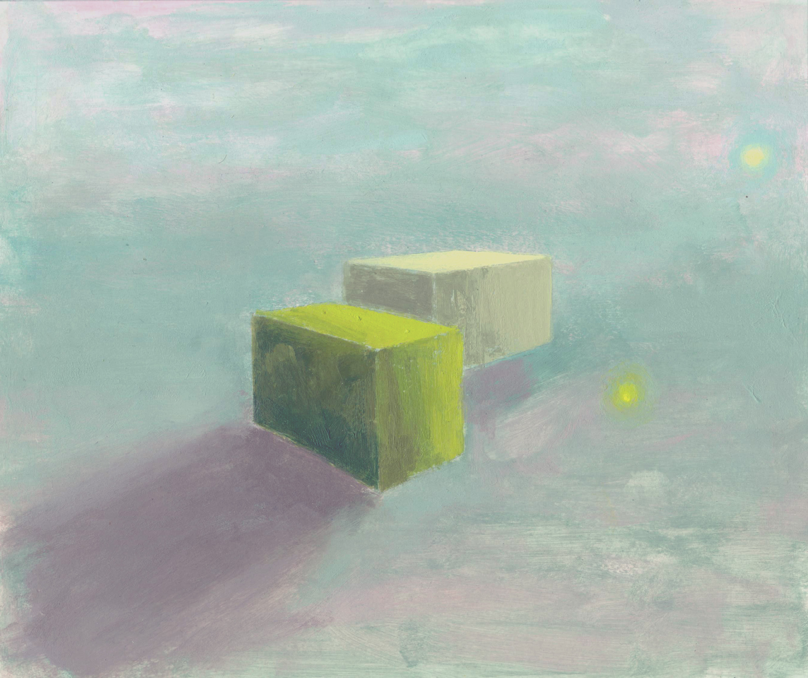
“One High Chroma Yellow Box and One Low Chroma Yellow Box (#34)”
Acrylic on 65 lb. neutral pH cover paper
8.5” x 11”
2002
“Flying By the Seat of My Paints and a Whole Lot More (#40)”
Acrylic on 65 lb. neutral pH cover paper
8.5” x 11”
2002
Optical Mixture and A Sense of Illumination
|
“Refined Spectrum, Optical Mix, Design Number Two”
Acrylic on 65 lb. neutral pH cover paper
11” x 8.5”
2002
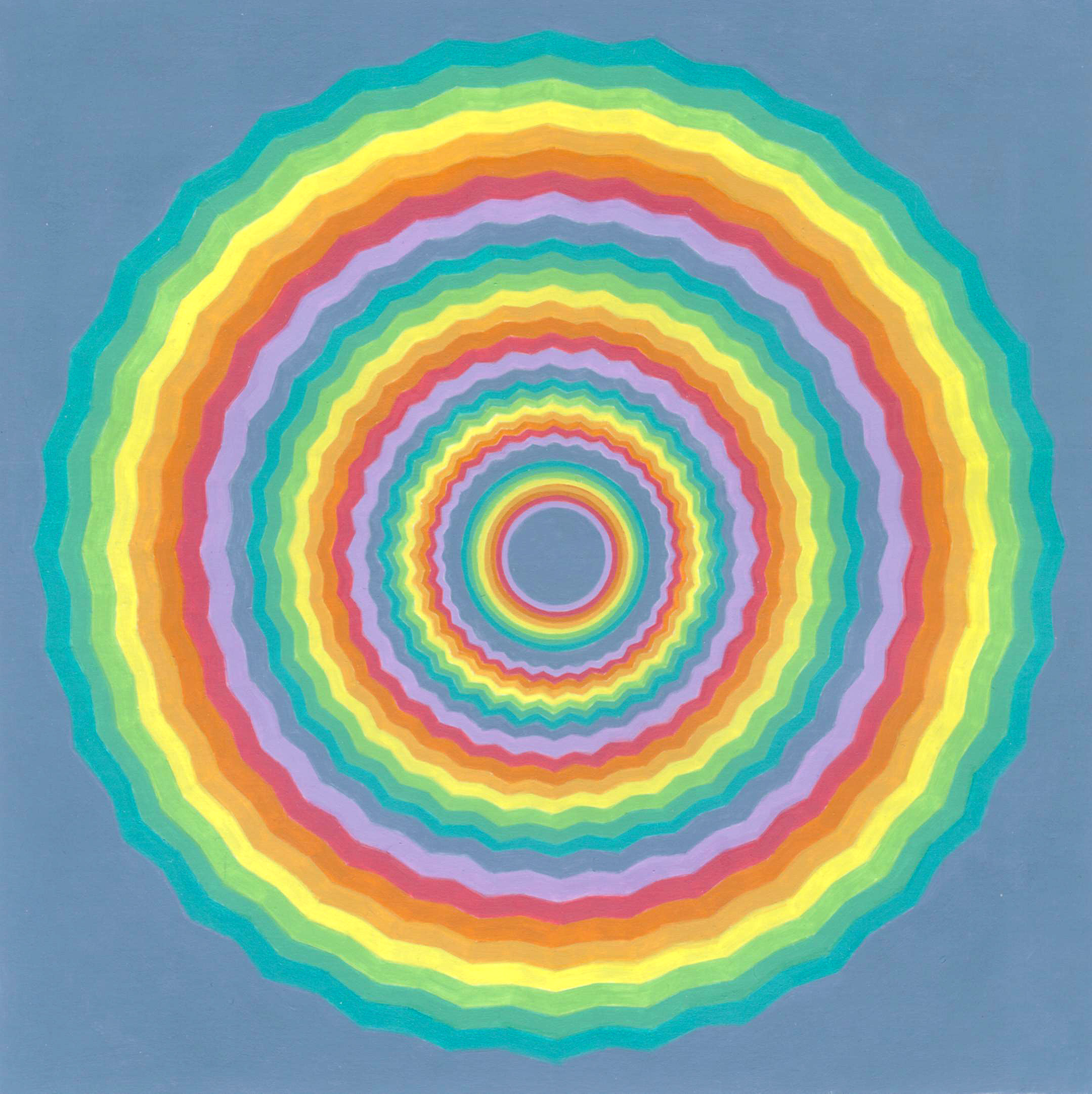
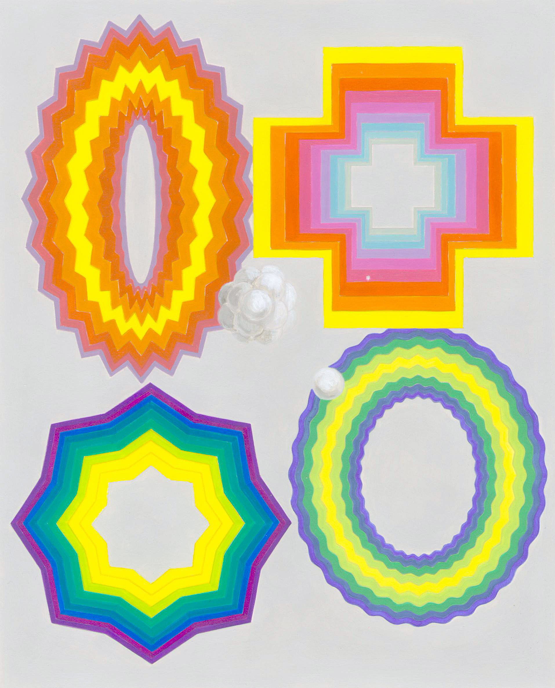
First I placed the softer color mixtures of nine hues in analogous order: purple, red, orange, yellow-orange, yellow, yellow-green, green, turquoise, and blue. Second, I rendered each circle using wavy stripes. I had read that “if colors are confused through head movements and the stripes are too close together to be seen separately, any optical mixture or overlapping tends to heighten saturation and create a vibrant shimmer. Brilliance is maintained because the colors are related to their neighbors.” (“Color Perception in Art,” Faber Birren, p. 32). Third, the sections of stripes vary in width from the center towards the outside. There is vibrancy in any section, whether the painting is viewed up close or from a distance. Up close the narrower sections of stripes pulsate, and the stripes of the wider sections are clearly separate. As the viewer moves farther away, the wider sections also begin to pulsate. (Copyright 2002 by Linda Jean Fisher)
 “A Sense of Illumination: Color Study #7, The Spectrum in Mist, Second Variation”
Acrylic on 65 lb. neutral pH cover paper
11” x 8.5”
2003
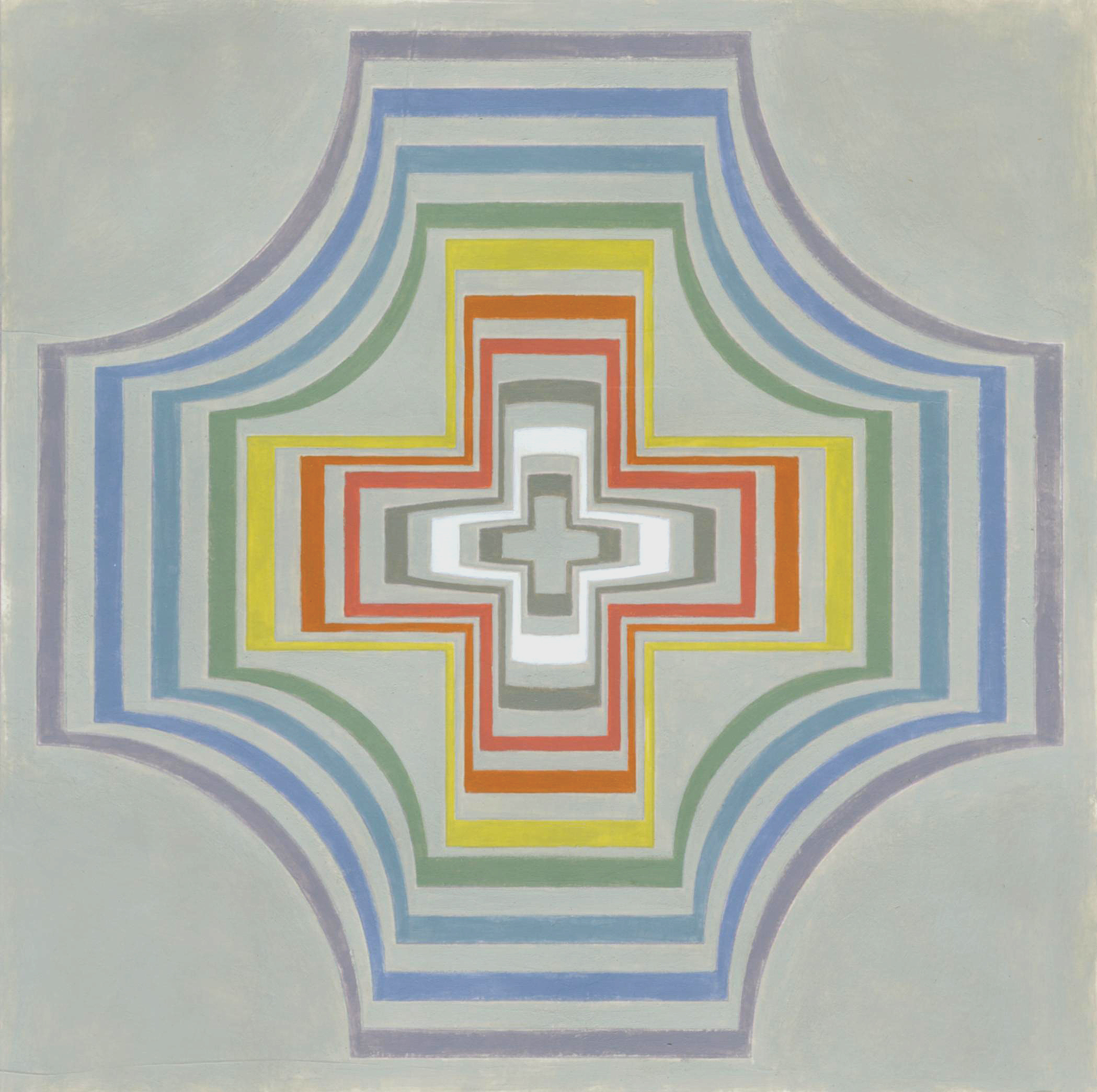
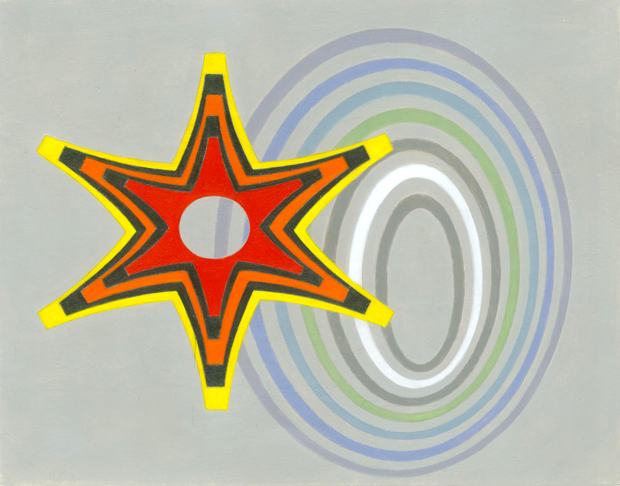
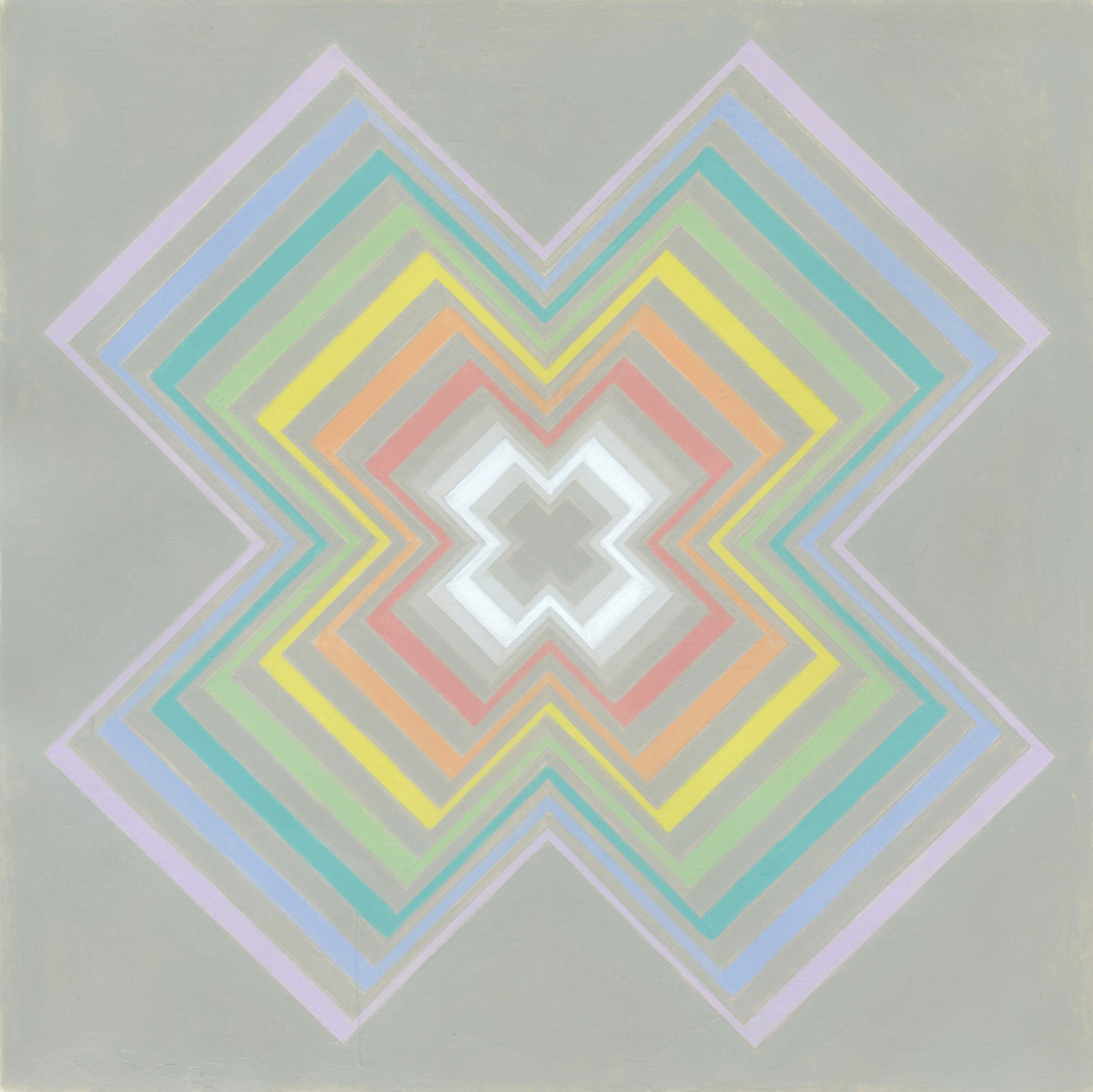
After studying optical mixture, I went on to examine a sense of illumination. I started with black, white, and gray experiments using a cross design. These pieces included the following effects of illumination: normal, dim, atmospheric mist, luminosity, and the impression that light is coming from behind the cross. Then I proceeded with my investigation using color. I created designs with both “Microsoft WordArt” and “AutoShapes.” I featured asterisks from different fonts for several pieces. Using the sharp ones for the hard colors and the rounded ones for the soft colors. I also wanted to incorporate the cross-over system of the brain and its correlation to the visual order of the colors on the color wheel. For these pictures, I painted the pointed asterisk featuring red, orange, and yellow on the left, and the curved asterisk including green, turquoise, blue and purple on the right. (Copyright 2003 by Linda Jean Fisher)
“A Sense of Illumination: Color Study #11, The Spectrum in Mist, Sixth Variation”
Acrylic on 65 lb. neutral pH cover paper
11” x 8.5”
2003
“A Sense of Illumination: Color Study #12, The Spectrum Lighted From Within”
Acrylic on 65 lb. neutral pH cover paper
11” x 8.5”
2003
“Pigments, particle physics, and so on, and so on.”
|
 “Nine”
Acrylic on 65 lb. neutral pH cover paper
11” x 8.5”
2003
During July and August of 2003, I made the commitment to produce at least one painting every seven days. “Nine” is from this collection of works. To learn more about this piece, and some others made from 22 January 2003-30 October 2003, refer to pages 1-23 of the exhibition catalogue named “The Color of Loyalty: A Tribute to Dr. J. Robert Oppenheimer.” Download the PDF file here.
The Munsell Color System
|
 “2004-27 (Upward Cylindrical Spiral Color Path)”
Acrylic on 65 lb. neutral pH cover paper
11” x 8.5”
2004
In March 2004, I decided to reinvestigate color mixing and color matching. Furthermore, I approached this process as if I’d never done it before. I chose the second edition of “The New Munsell Student Color Set” by Jim Long and Joy Turner Lake as an instruction tool. I put together a booklet that provides an overview of this experiment. Download the PDF file here.